The website improvements I mentioned in my first blog entry went live today! These changes improve usability for Art of Sound Music customers and allow us to post new works more quickly.
Highlights of our website improvements
Easier and faster to add products to shopping cart
Previously, if you typed “soprano” into our search box, you would see a list of many nice pieces, including one especially lovely piece by Barbara Harbach called “Emily!” that you might want to buy and have us ship to you:
In the past, to add the “Ship to Me” version of Emily! to your shopping cart you’d need to:
- Click the radio button next to “Ship To Me”
- Click in the text box that says “Add: 0”
- Type a backspace to erase the “0”
- Type a “1”
- Scroll to the bottom of the page
- Click on the blue “Add selected products to cart” button
Here’s what you see today when you reach that listing after a search for “soprano”:
We auto-insert a 1 (instead of 0) in the quantity box, and we now place “add to cart” buttons next to Download PDF and Ship to Me . To add the hard copy to your cart you would simply need to:
- Click on the “add to cart” button to the right of “Ship to Me”
Having 1 step instead of 6 allows customers to get things done more easily and quickly.
A dash of color
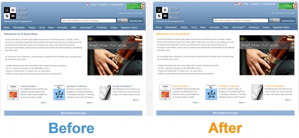
The earlier version of our website relied heavily on the color blue, and that was giving us a case “the blues”. Key headings now sport a cheerful dash of orange to brighten your day! Orange is also the background color for our blog.
Menu improvements make products easier and faster to find
We’ve reorganized our product menus to make things easier to find. For example, in the past choosing “Brass Quintet” would lead you to a list of the many hundreds of items we have in that category, which could be a bit time-consuming to look through. Now, when you click on “Brass Quintet”, you can limit the search results by grade, style, occasion or (like before) show every product in that category.
Products appear in multiple categories
Many of our works don’t fit neatly into just one category. For example, Low Motion by Ingo Luis, a feature for Bass Trombone with 5 trombone accompaniment, now appears simultaneously in the Bass Trombone category and the 6 Trombones category, making it easier to find.
Many new “behind the scenes” features
These enhancements allow us to post new works even more quickly!
Reach our blog from our store
There’s a link to our blog at the top and bottom of each website page.
Improved choral score pages
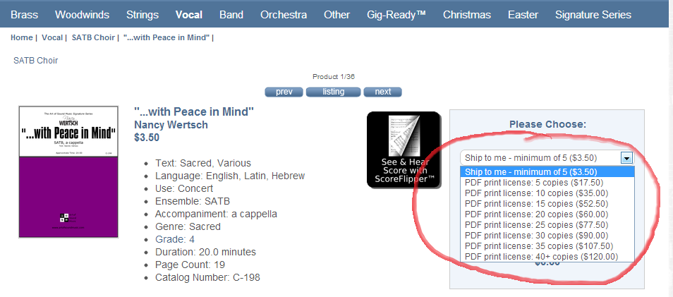
We have some great choral composers on our roster such as Nancy Wertsch. We list choral works a bit differently than instrument works – they usually have a minimum order quantity and choirs need lots of copies for their members. Before, our choral product pages had a drop down list starting from the minimum quantity of 5 and then going up in increments of 5. This detail took more some time to set up, stopped customers from ordering the EXACT quantity they needed and took up a lot of screen space as you can below with Nancy’s “…with Peace in Mind”:
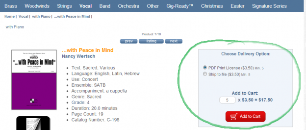
As of today, that screen has simplified to show just 2 choices (see below). It uses less space, is more flexible for customer and is easier for us to prepare. That’s what I call a win/win solution!
New shortcut URL to reach our website
Need to get to artofsoundmusic.com fast? Just type “aosmus.com” into your browser.
Coda
We’re working hard to make our website the very best in the sheet music industry, and we’ll be introducing more time-saving features in the future. We’d welcome any suggestions you have in the comments section below.


